
Role
User Research
Product Strategy
UI Design
Interaction Design
Usability Testing
Tools
Figjam
Notion
Maze
Figma
Dovetail
Timeline
5 weeks
The Problem
The cold shower settings preceding the shower challenge were confusing. This resulted in user frustraiton and the user not completing the cold water challenge.
The Solution
Reducing friction during the cold-water challenge would allow users to successfully complete the challenge and increase conversion rates to paid plans.
Usability Review
Within a team, I conducted a usability review of the Wim Hof Method app, specifically the 20-day cold shower challenge, to uncover the pain points and wow moments of the product experience for a user. Needless to say, it was chilly.
Business & User Frustrations
The 20-day cold shower challenge needed to be easier for users to complete. By streamlining the challenge, users would feel comfortable and motivated to finish the challenge thereby increasing conversion rates from a free to premium paid plan.
Primary Frustration
The primary frustration surrounded the pre-shower settings screen. Users were given an abundance of choices without clear labels or signifiers, which resulted in confusion and fewer users successfully completing the cold water challenge.
Secondary Frustration
The secondary frustration surrounded the home screen. Users were unsure where to begin due to the lack of a clear hierarchy. This resulted in fewer users selecting and completing the cold water challenge.
Competitor Benchmarking
With a usability review complete, my team and I moved on to competitive benchmarking to analyze existing UX/UI standards in direct and indirect competitor products and to gain inspiration. We took particular note of the learnability, efficiency, memorability, errors, and satisfaction of direct and indirect competitor products such as Cryoshower and Calm.
Problem Space
We focused on the specific problem space surrounding the user's experience as they are setting up the app to support their first cold water challenge. To ensure we ideated on a clear user problem, my team and I formed a "how might we" question to guide our efforts while creating a solution.
How might we ensure users feel confident during their first cold water challenge so that they return in subsequent days?
Ideation
We ideated using crazy 8's and mind mapping. This created a judgment-free zone for ideas to flow. It also ensured that we didn't simply go with our first idea. Following ideation, we summarized our improvements and additions keeping in mind the added value for the business and the user. Given that we had a 5-week timeline, we also considered the time and effort that would be needed to complete each solution.

What can we improve
Progressive disclosure of each shower setting
Introduce common conventions like helper text or common colors for hot and cold
Simplify the settings options for new user completing their first shower challenge
What can we add
Set reminders for daily cold showers
User Flows
We created user flows to identify existing problems with the logic behind the interface and clarify the pathway in need of improvement.


Rapid Prototyping
Before jumping in with hi-fidelity work I spent time rapidly prototyping the experience below in lo-fidelity. This is important because it allowed my team and I to annotate our individual sketches and decide where components were needed in the final design.
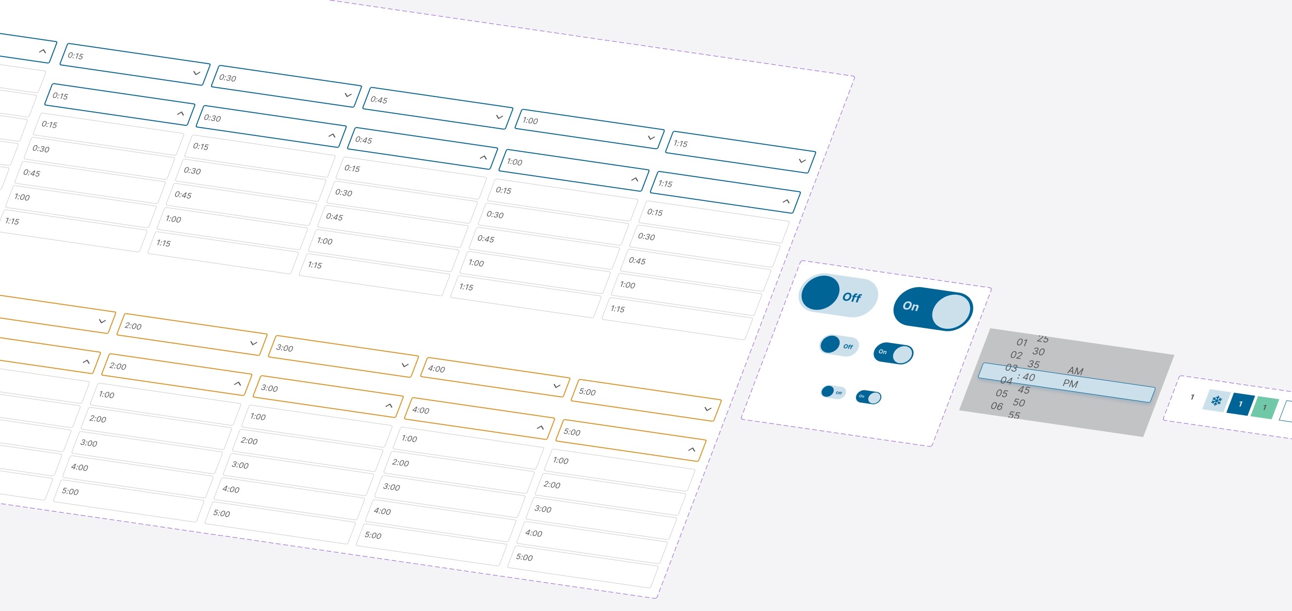
Styles & Components
As a team, we updated the client's existing action colors and built out repetitive components such as buttons, pre-shower timers, and mid-shower timers. I specifically created the pre-shower timer, toggle switch, reminder-timer scroller, and calendar components below.
High Fidelity Prototype
The final prototype showcased a simplified home screen, drawing the user's attention to the cold water challenge initially. To allow the user to experience the challenge immediately, the shower settings were preselected. We utilized helper text to prepare and orient the user for the challenge.
Common color conventions were implemented (orange = warm, blue = cold) for the mid-shower timer. A drastic color change on the mid-shower timers allowed the participant to view the status of their shower from a blurred shower door. This visually instructed the user to switch from a warm to a cold shower.
In addition, we implemented daily reminders and gamification for the cold water challenge. This should hook the user increasing the likelihood of a user returning in subsequent days.
Usability Testing
With the prototype created a testing script was formed with scenarios and tasks for the user to complete to validate the prototype with real users. To test the prototype Maze was used to gather feedback following every task.

Test outcomes
Having tested the prototype, I learned the importance of getting feedback as soon as possible. It helped identify blind spots in the design that confused the user and in turn gave us specific areas to iterate on and improve.
I realized how important progressive disclosure and clear design hierarchy are especially when considering improved conversion rates. Progressive disclosure and design hierarchy reduce user friction leading to completed shower challenges and conversion rate increases.
Three key learnings
Collaborating with my team streamlined the design process. We were able to work off one another and bring our individual talents to the design. We were able to iterate on the spot because of our teamwork.
Building components was difficult for me. I'd like to be better at the component level so I can leverage the power of atomic design.
Usability testing is key! It focused my attention on areas that user found particularly confusing.
Next steps
The next steps I would take if more time was allotted to iterate:
I'd refine the UI Design (consistency in button size, implement better spacing on specific components, reevaluate color choice for specific screens).
I'd reconsider the function of certain elements in the design. For example, misclicks were high on the "Confirm Settings" and "Start Shower" buttons. To eliminate this, I'd combine the two and create one button.
I'd revamp the gamification. It was clunky and could use streamlining to hook the user. Revamping this section could improve the likelihood of the user returning to participate in another cold shower challenge.