Role
User Research
Product Strategy
UI Design
Interaction Design
Usability Testing
Tools
Figjam
Notion
Maze
Figma
Otter.ai
Dovetail
Zoom
Timeline
5 weeks
The Problem
Group creation and sharing were not available features. If a MyPlace member wanted to easily share their home within a secure and personal group, it was not an option.
The Solution
Simply put — create a group creation and share feature that allows users to securely create and share a personal group with autonomy to manage as the group administrator sees fit.

Usability Review
Within a team, I conducted a usability review of MyPlace beta, specifically the onboarding process and home page, to uncover the pain points and wow moments of the product experience for a user.
Business & User frustrations
MyPlace did not have the ability for users to create their own groups. At the time of the project, the team at MyPlace created a group for you, and admin privileges were allocated to one person to manage the group. This resulted in the user becoming frustrated due to a lack of autonomy when sharing their own home and joining a group in a secure and personalized manner.
Primary Frustration
When creating a group or moderating existing groups users are aren't able to manage groups autonomously which results in frustration for the user and additional administrative work for MyPlace.
Secondary Frustration
When sharing a home without autonomy users are aprehensive in generally sharing such a personal aspect of their lives which results in a lack of confidence in the user and less use of MyPlace as a product.
Competitor Benchmarking
With a usability review complete, I moved on to competitor benchmarking to help me identify standards in competitor products that could be used to improve the existing experience. We reviewed the onboarding process when starting a group for Figma, GroupMe, Facebook, and Meetup and took particular note of the learnability, efficiency, memorability, errors, and satisfaction of competitor products.
Problem Space
Combining the research in my usability review and competitor benchmarking helped me begin to identify a general problem space. Additionally, asking questions helped refine the issue at hand:
Who is affected by the problem?
What is the key problem?
Where does this problem occur?
When does this problem occur?
Why does the problem occur?
Why is the problem important?
Not only did these questions help summarize the problem space, resulting in our "How Might We" question below. It also helped us outline a research goal to support our research interview.
How might we provide a smooth group experience through group creation and management so users feel confident sharing their home securely in a way that allows for more use of MyPlace as a product?
Research Interview
We developed a research plan to outline our expectations, our approach, and plan/define our research goals. We then wrote a research interview script and used the script to conduct multiple interviews. When interviewing, we recorded our session using Zoom and Otter.ai to grab the transcript.

Synthesized Results
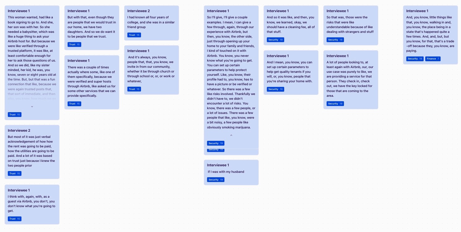
To validate the initial observations made from our usability review and competitor benchmarking we synthesized survey results from user interviews using Dovetail. We identified key insights and problems that users experienced when sharing their home and creating groups.
As noted in blue in the illustration below, security and trust were major motivations to consider when building out a home sharing/group creation feature for MyPlace.
Primary Insight
When sharing a personal space, users prioritize trust and security above other values.
Secondary Insight
When searching for a place to stay top considerations include, location, amenities, budget, and autonomy.
Information Architecture
We mapped MyPlace's existing website content to map users' experiences with the product and to help us understand and organize the existing information on the site. In doing this, we were able to improve content hierarchy and users' home sharing experiences, as well as create a group creation onboarding process.
User Flows
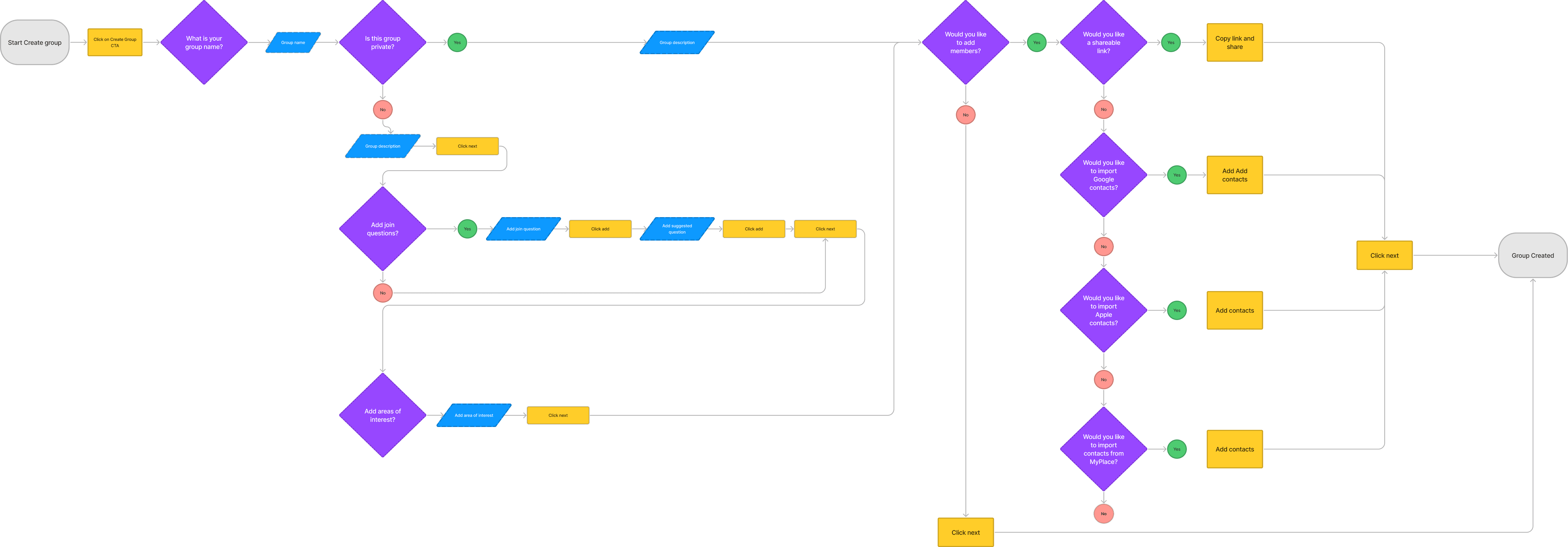
We mapped user flows to identify existing problems with the logic behind the interface and clarify the pathway in need of improvement.
Ideation
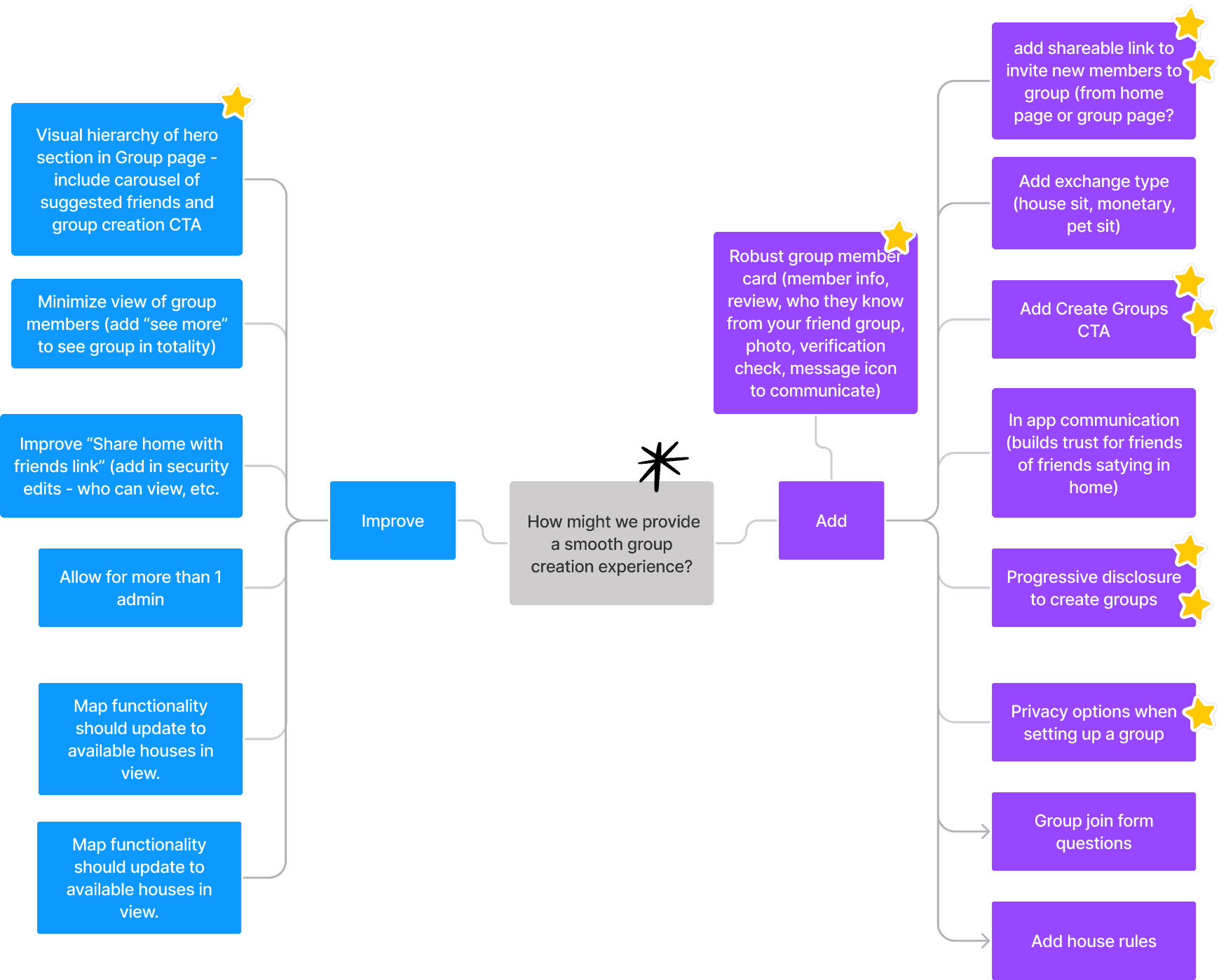
After gaining an understanding about user motivations and business goals we ideated using crazy 8's and mind mapped solutions to add features and improve upon existing MyPlace features. After ideating as individuals, my team and I came together to land on the top ideas that solved business and user problems.
What can we add
Add Create Group CTA
Progressive disclosure to create groups
Robust group member card (member info, review, who they know from your friend group, photo, verification check, message icon to communicate)
Shareable link to invite new members to group (from home page or group page)
Privacy options when setting up a group
What can we improve
Visual hierarchy of hero section in home page – include carousel of suggested friends and group creation CTA
Rapid Prototyping and Wireframes
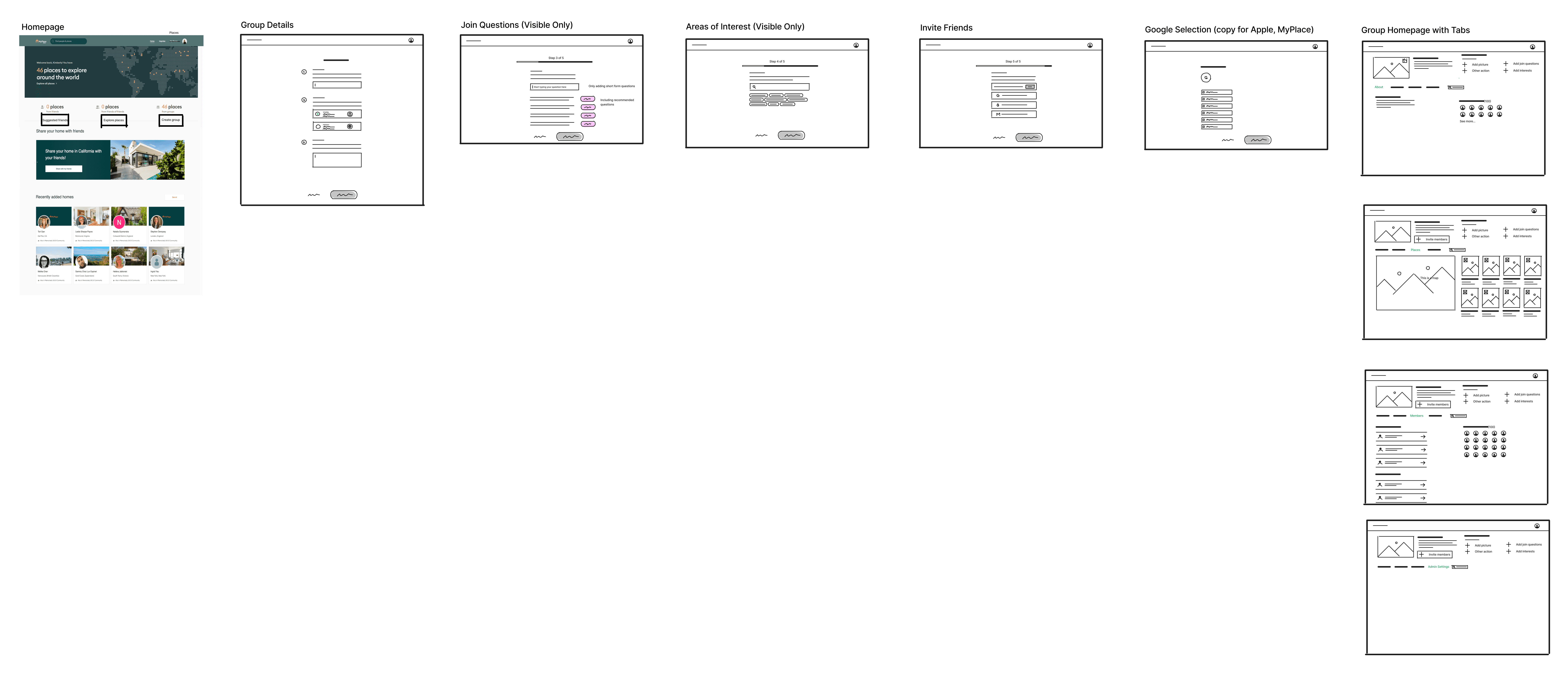
Before jumping into hi-fidelity work I spent time rapidly prototyping the solutions to our group creation and group homepage experience in with annotations. This is important because it allowed my team and I to come together with our individual designs to collectively create wireframes to prototype.

Styles & Components
Before creating the hi-fidelity prototype we established the product styles and utlized interactive components in Figma to ensure an efficient and consistent design as we moved forward.
High Fidelity Prototype
In the final prototype, we introduced a more interactive, visually organized home page as well as the ability to easily and securely create a group using progressive disclosure and administrative privileges.
Immediately below the hero section, the user can clearly find friends, create a group, or share their home. Utlizing the tertiary action color and center alignment we called the user's attention to the group creation CTA.
After clicking on "Create Group", the user is walked through a series of screens to create their group how they see fit. We utilized progressive disclosure, so as not to overwhelm the user when setting up a new group. Although we included screens to gain information about a group such as group name, visbility, description, join questions, areas of interest, and adding members — users can skip all screens once the first screen is complete (group name, visibility, and group description). In doing this, a group can be quickly created and edited once at the Group Page.
Usability Testing
With the prototype created a testing script was formed with scenarios and tasks for the user to complete to validate the prototype with real users. To test the prototype Maze was used to gather feedback following every task.
Test outcomes
Having tested the prototype, I learned the importance of security and trust when sharing one's home and creating groups. Understanding this key insight and using it as a guiding principle should drive more traffic to MyPlace through group sharing and increase a user's confidence when sharing their own home.
Three key learnings
Understanding user motivation is key! Building any feature without understanding the "why" behind a user's action can lead to unecessary design work.
Sequencing information across several screens (progressive disclosure) is the best way to walk a user through a process, but designing this process as simply and effectively as possible can be challenging.
Oftentimes building out a new product feature isn't clear. Taking the time to really understand the product, the business goals, and user needs can help define the process and create a minimum viable product -> leading to more feedback, iteration, and ultimately improving the product.
Next steps
The next steps I would take if I had more time to iterate:
Include a "skip" button during group creation onboarding. Although a user can choose the "next" button to skip most screens, it isn't clear that certain pages can be skipped. Adding a "skip" button allows the user to set up a group immediately and edit it later in the group page.
Adding group join questions were particularly confusing for users in our Maze testing. I'd remove the join questions during the onboarding process and move them, instead, to the group page once a group is created.
The misclick rate on the user's home page to create a group was high. Half of the Maze testers misclicked the "Explore Places" CTA in the hero section. I'd make the Create Group button more obvious. Instead of "Discover More Places" in the hero section, I'd update it to invite the user to create a group.


